
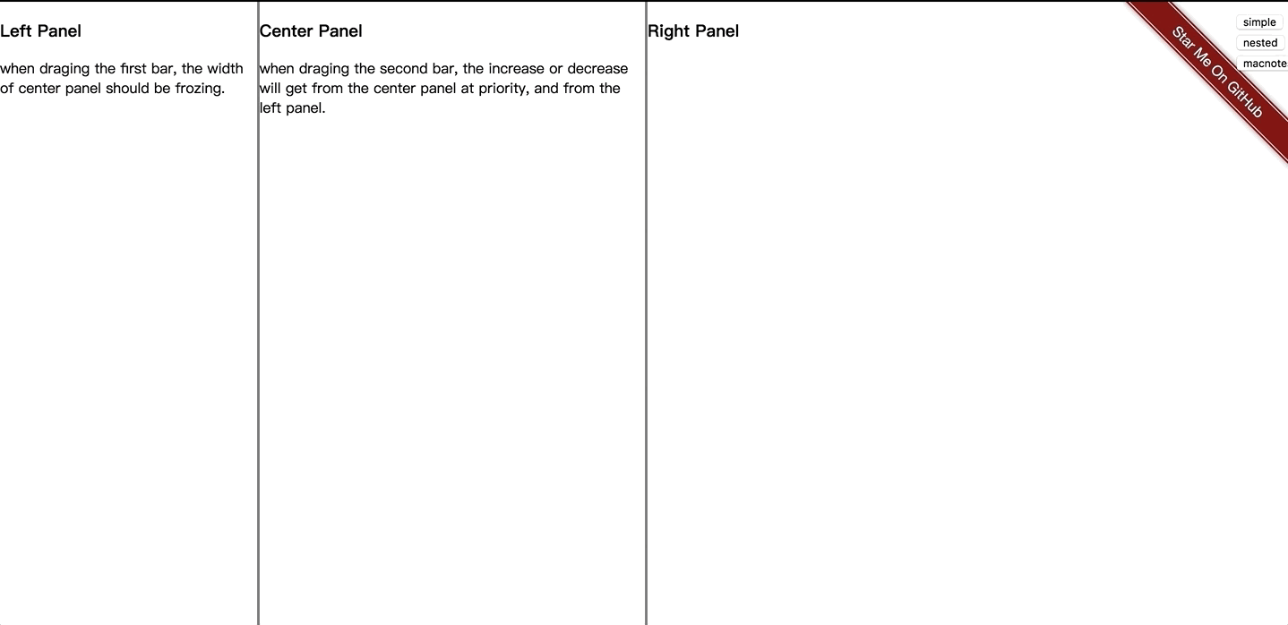
this is a angular splitter that could drag the responsive layout, and also act like the layout of notes on mac.
Online
https://guguji5.github.io/angular-splitter-demo
How to run
1 | git clone https://github.com/guguji5/angular-splitter.git |
of course you must have angular-cli installed.
Angular Support
angular 5~6
Document
Component <tam-splitter>
| @Input | Type | Default | Details |
|---|---|---|---|
| direction | string | “horizontal” | Select split direction: “horizontal” or “vertical”. |
| splitterBarWidth | number | 8 | Gutters’s size (dragging elements) in pixels. |
| useTransition | boolean or number | false | Use transition when collapsing or expanding. when this param is a number, it will be a millisecond value set to the property ‘transition-duration’, should be between 100 and 1000 |
| type | string | ‘standard’ | it has two value(standard, macNotes), which controls the behavior of the drag, macNotes type will act like the notes on mac |
| @Output | Param | Details |
|---|---|---|
| sizeChange | {barNum: number, sizes: Array<number>} |
Emit when draging, return the index of bar and the sizes of panels |
Component <tam-splitter-panel>
| @Input | Type | Default | Details |
|---|---|---|---|
| size | number | null | Size of the panel in percent (value between 0 and 100).all panels sizes should be equal to 100 |
| max | number | null | Max size of the panel in percent (value between 0 and 100). |
| min | number | null | Min size of the panel in percent (value between 0 and 100). |
| visible | boolean | true | Allow to toggle panel visibility |
| @Output | Param | Details |
|---|---|---|
| collapsedChange | {collapsed:boolean, sizes: Array<number>, collapsedComponentSize: number} |
Emit when collapsed or expand, return the collapsed, the sizes of panels and the size of collapsed panel |
simple demo:1
2
3
4
5
6
7
8
9
10
11
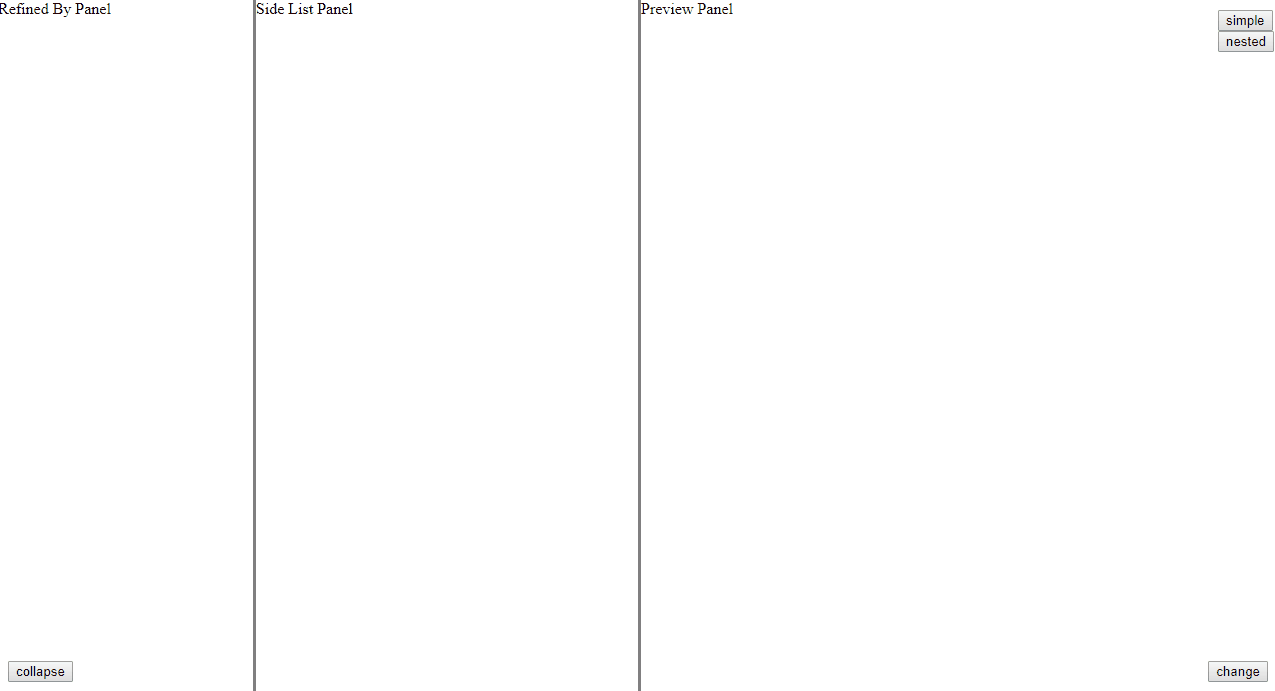
12<tam-splitter splitterBarWidth=3 [direction]="horizontal" (sizeChange)="sizeChange($event)">
<tam-splitter-panel [size]="20" [max]="30" [min]="10"
[visible]=true (collapsedChange)="collapsedChange($event)">
Refined By Panel
</tam-splitter-panel>
<tam-splitter-panel [size]="30" [max]="50" [min]="20">
Side List Panel
</tam-splitter-panel>
<tam-splitter-panel [size]="50" [max]="70" [min]="20">
Preview Panel
</tam-splitter-panel>
</tam-splitter>
nested demo:1
2
3
4
5
6
7
8
9
10
11
12
13
14
15
16<tam-splitter splitterBarWidth=3>
<tam-splitter-panel [size]="20" [max]="30" [min]="10" (collapsedChange)="collapsedChange($event)">
Refined By Panel
</tam-splitter-panel>
<tam-splitter-panel [size]="80">
<tam-splitter splitterBarWidth=3 [direction]="'vertical'">
<tam-splitter-panel [size]="30" [max]="40" [min]="20">
Side List Panel
</tam-splitter-panel>
<tam-splitter-panel [size]="70" [max]="80" [min]="60">
Preview Panel
</tam-splitter-panel>
</tam-splitter>
</tam-splitter-panel>
</tam-splitter>